UX/UI DESIGNER
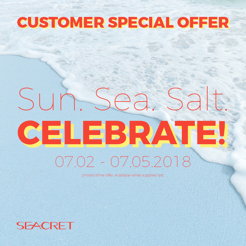
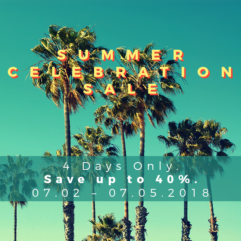
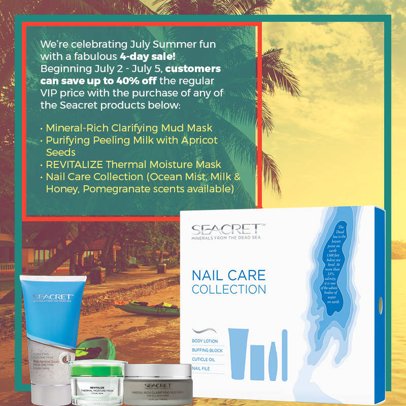
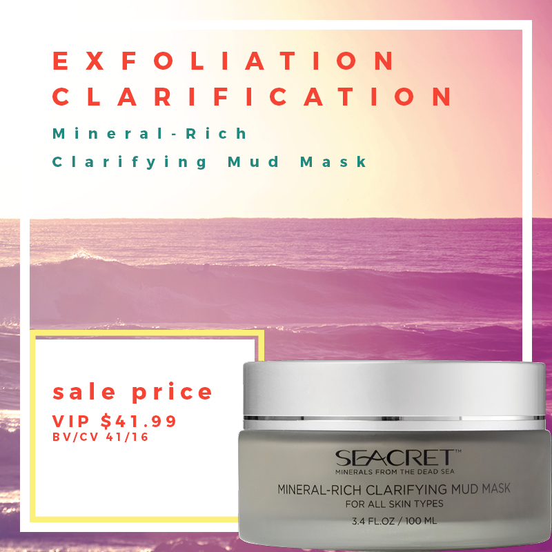
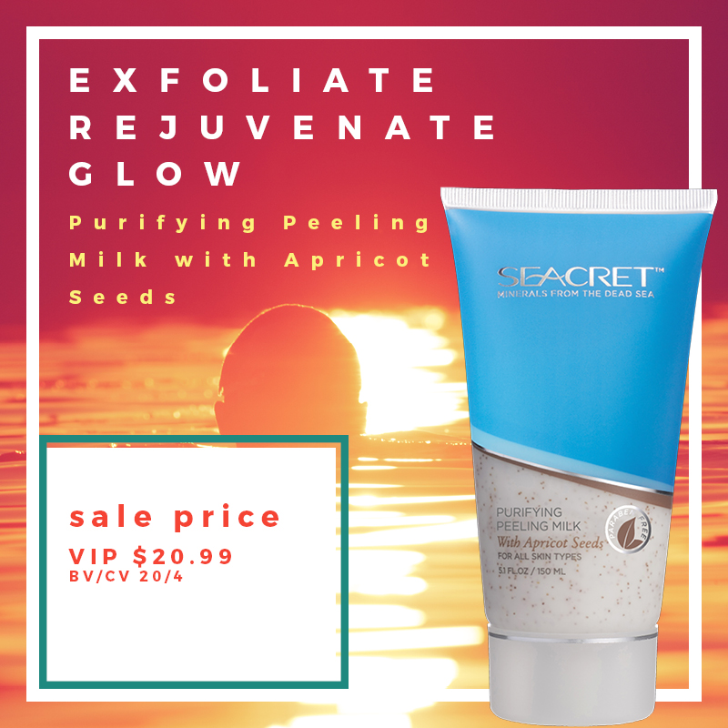
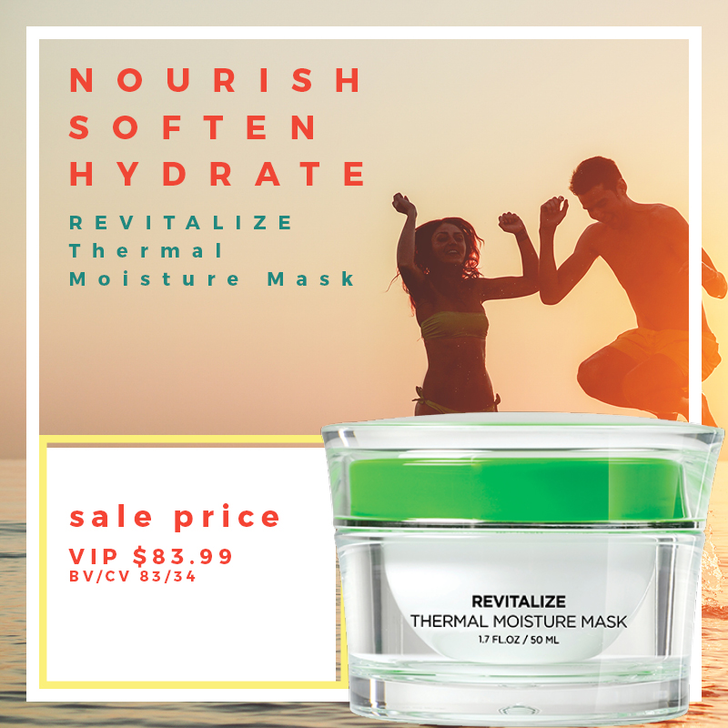
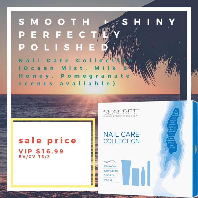
These are a series of images for a pdf booklet I created for my company promoting a sale on select products. The direction was to create a vintage summer look with bright colors.
This is the flyer and banners I made for the 2018 Agent Destination promotion.
This is the order form and banner I made for Valentines Day 2018.
This is the program I created for the 2017 Seacret convention titled SEACON.
I started designing for this promotion by first looking at images on the Playa del Carmen resort website. One of the images I came across was the striking image of the tribal warrior with face paint on. Instead of going with a typical beach photo, I thought it would be interesting to use the man as the main visual element. So I cut the man out of the image and placed him on the right of the page, at full length. I then played around with the treatment of the type for the Diamond Destination header, and added the black bar below it, and added the tag line "Cross the border into paradise" in white on top of it. That was the bulk of the design. After that things came together fairly easily.
For the backside of the flyer, I placed the Diamond Destination header in white on top of a black box in the upper left to keep the design consistent with the black bar on the first page. I then made a grid of images on the right side, using photos of the resort, and added the additional text below the header on the left.
I then created web banners, banners for print, and social media images all using the same design elements. For the qualifiers flyer at the end, I decided to give it a little bit of a different look. What makes the design for this flyer is the 1 inch margin around everything. I set the type for the Diamond Destination header large and bold, set 3 pictures side by side, and added the qualifying peoples names at the bottom.
The first thing I did to begin creating collateral for this event was to find the right picture for the header. After I found it, I gave the header "Agent Destination" the same type treatment as for Diamond Destination. I then added a grid of photos below the header on the right, and added the copy on the left. Since this event is running simultaneously with the Diamond Destination event, I added a black bar below the header to give it some type of consistency.
For the 2nd page of the flyer, I changed the header to be 3 photos from the resort's website to showcase what the event qualifiers would expect on their trip. I also made some of the copy a blue gradient, which consists of a few blues from the header on the first page. I used these design elements on the rest of the flyers I created.
Below the flyers, is a large vertical banner I created that was printed for the event. The photos I chose to use were of activates that the trip goers could participate in. Fun at the beach, kayaking, and snorkeling. For the type, I used a gradient that matched the color of the water from the top left to the bottom right.
The last item I created for this event was a social media square that is a photo grid, and contains photos I used from previous collateral.